Chewy.com is one of the largest online retailers, it definitely is the largest pet etailers in the world. Chewy was acquired by Petsmart for over $3 billion dollars. There’s a few reasons why Chewy became what it has become. If you’ve never heard of Chewy, it sells all types of pet food, toys, and supplies at a discount.
In 2019, Chewys revenue was $4.8 billion. Today, it also brings in around 36 million monthly visitors.
With a strong e-comm team and incredible sales, let’s take a look at what Chewy does on their product page and what elements are there that may give you ideas to implement to optimize your product pages. After all, sometimes the best strategy is to look at what’s working, it’s not always about reinventing the wheel.

PRODUCT PAGE ELEMENTS
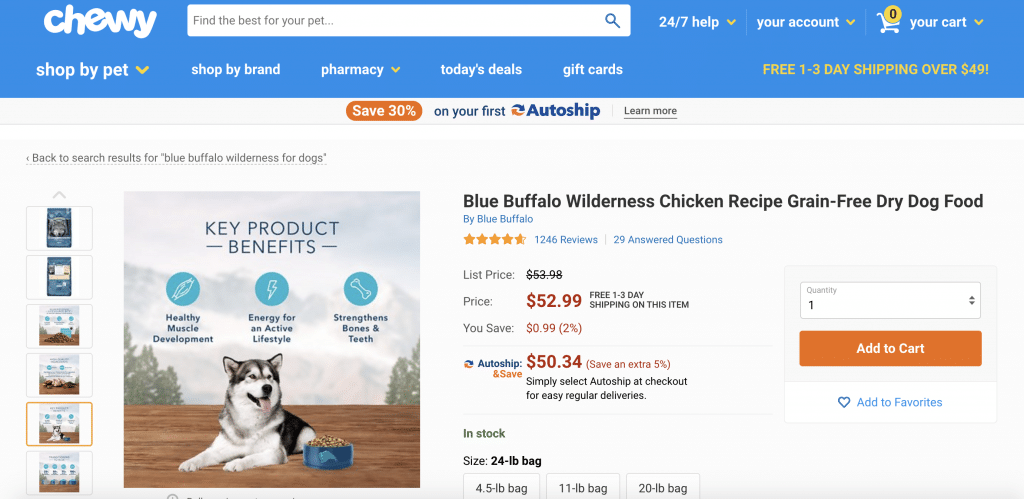
TITLE: The product title doesn’t only have the brand of the product, but also has the flavor. Typically, a retailer this size tries to keep product titles a bit shorter but in this case, Chewy does seem to take SEO into account and make the product title a bit longer including some keywords like ‘Grain-free dry dog food.’ And…sure enough, if you Google ‘Grain-free dry dog food’ you can see Chewy product pages ranking in the first page, toward the bottom.
BREADCRUMB LINKS: This one is important to take note for SEO reasons. You can see the brand of the product highlighted with a link below the title. This gives some good SEO value to the brand. After Googling ‘Blue Buffalo,’ Chewy ranks #2 for that keyword.
REVIEWS: It’s 2020, if you still don’t think reviews are a crucial aspect of a sales cycle in e-commerce, it’s time to get with it. Reviews are a must in a product page. It lets customers know about what people think about the product and also shopping that product on the page. This element has real influence in the purchasing cycle.
Q&A: This one is also incredibly important, and for more than one reason.
- The customer doesn’t have to leave the page to find answers on questions they may have about the product.
- Builds good UGC (user generated content) for SEO. Consumers are typing in questions to Google all day long and if the question is covered in your product page, it will lead consumers there.
- Gives your website more street cred and authority on the product for having answers to the question the consumer may have on the product.
PRICING: Notice how Chewy has 3 different pricing elements on the product page. The list price, sale price, and the subscription pricing. Seeing how much you’re saving is an element consumers like to see, as it’s easily to display, but you’d be surprised how many retailers don’t show the customers the actual savings. Free delivery is highlighted next to the price, AGAIN. You can also see this element play-out again in the header. Take this as a sign they seem this element very important, and probably for good reason. Chewy highlights the price in red and from what you can see, makes the font larger to showcase this element on the numbers side.
AVAILABILITY: You can see the IN STOCK verbiage in green letting customers know the availability of the product.
SIZING: Chewy chooses to display different sizing options on the product page. Some retailers may opt to create different sizes for the same product which may be an SEO play but this makes it extremely easy for the consumer to know there are different options for sizing and providing a good experience.
BUYING ELEMENT: Chewy chooses the ADD TO CART verbiage on the button to start shopping for the product. Add to Cart seems the successful default option for e-commerce rather than BUY NOW or CHECKOUT NOW. The bright orange color element calls attention to the consumer.
PRODUCT IMAGES: We can see from here that Chewy has SIX product images. What’s interesting is, they aren’t all images of the product but rather they use that real estate to include marketing material on the product itself. Why? Because they know that customers are far more photo-centric than copy-centric and the images themselves can sell the product. You can see value propositions for the product on each and every one of the marketing images they use. I find that to be an extremely powerful sales strategy on the product page and one most dont utilize.
WORTH NOTING: While not visible at first, if you scroll down to the 6th image, you are then promoted with a VIDEO option. Video can be such a big element on a product page as a consumer may just make a purchasing decision based on watching a video alone, and leaving the copy behind.
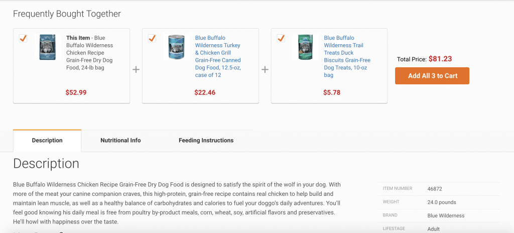
FREQUENTLY BOUGHT TOGETHER ELEMENT: This one is quite interesting, and again, while it may seem a bit obviously, I can tell you most e-comm websites don’t do this. This is an element gathered from consumer data that shows the products that were frequently bought together. Amazon does a decent job with this element but this is probably the best I’ve seen as its quite prevalent on the page with the add to cart button and price of all the items together. That probably gives them a nice lift in AOV (Average Order Value) and lift in sales.

DESCRIPTION: Chewy doesn’t go overboard with the copy on the description side of things. The main thing that stands out is the fact that they list the benefits as the most important part of the product description. In order to sell, a customer wants to know how the product will benefit them (or their pet in this case.) Interesting to see they left features out. On the right hand side of the description, they list some key things to know about the product with simple segments such as special diet, breed size, etc. Basically, who it’s for and who should use it.
ENHANCED CONTENT: This is something that most notably you may see on Amazon, but Chewy is doing a great job at showcasing content on the brand itself and introducing the brand to a consumer who may be in the research phase of the product or wants to know a little bit more about the brand before purchasing. The enhanced content section has great information and images on the brand. It outlines some key features on the product, the brand, what type of dogs it’s for, etc.
PRODUCT COMPARISON: This is a great feature on the product page from Chewy. While the brand has many different flavors for dogs, they feature an easy to read comparison chart to see who the product is best suited for and how it differs from the brands other flavors.
SUMMARY
Overall, I think analyzing this product page gives retailers a lot to think about and implement for conversion rate optimization. I know as for myself, while all these elements are nothing out of the ordinary, are not always implemented for one reason or another and gives you something to think about.


