I can tell you over my career as a marketer there is a piece of content, that overall, usually converts really well or builds a great part of the funnel, from top to bottom. That is comparison content. These are important pieces of content as consumers who are in the market for any particular product are usually between at least two products, right? Consumers need a reason to know why YOUR product is better or different than the leading product in your space. After all, if you don’t have that value proposition, at least one, you’d better get back to the drawing board adn work on that.
If you’re on Facebook or Instagram, you may have seen these comparison ads that compare one product from the next. SEMRUSH put a great piece of content on an ideal comparison piece of content.
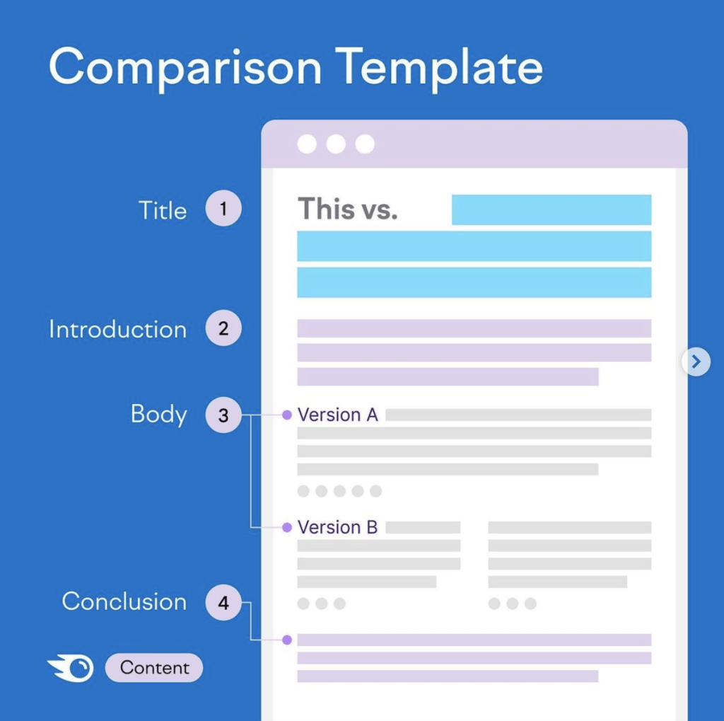
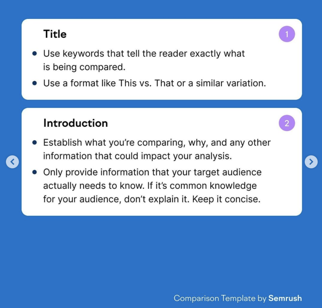
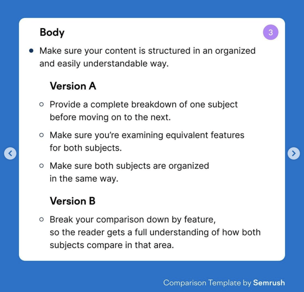
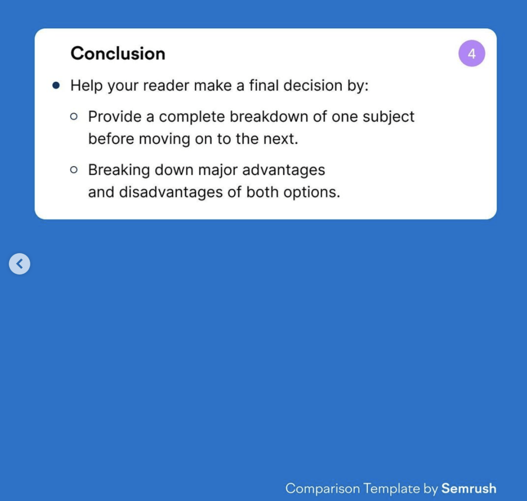
The ad is where you’ll capture audience attention quick and drive them to this page. Let’s see some examples of comparison ads or graphics that you can use as inspo to create a great piece of content on the ad side.
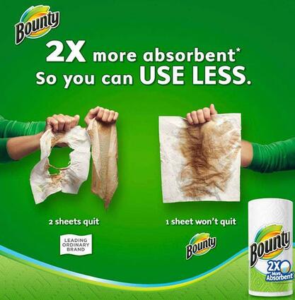
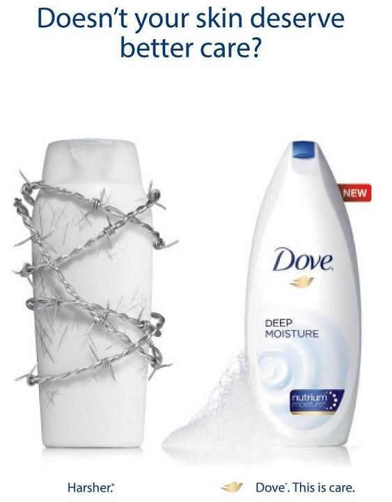
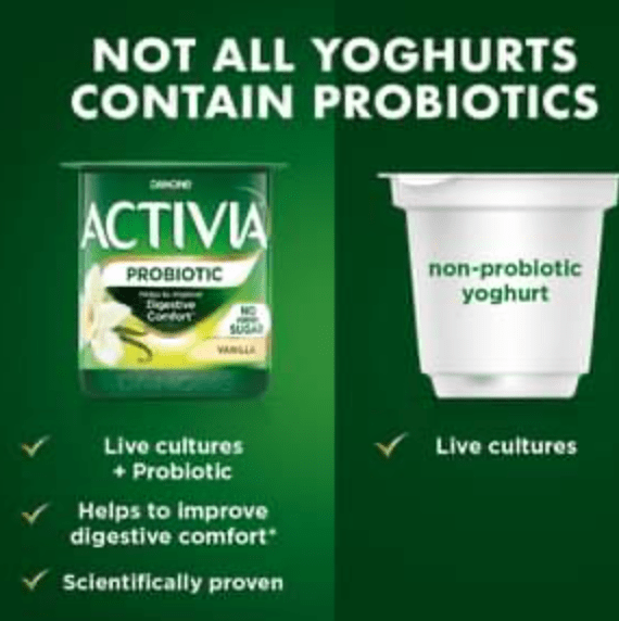
Get creative when comparing your product. Its extremely important to note that comparison advertising, while legal, does have it regulatory side where you must ensure comparison claims are 100% truthful and not misleading. One way to avoid any issues is keep it factual but general.
