Today on the ETREND interview series where we interview the industry’s leading experts we have Liza Hudson.
Liza is a CRO expert with the Landing Page Guys, which specialize in building high converting, affordable landing pages.
CRO (conversion rate optimization,) is a topic we focus on heavily at ETREND because it a a key factor in creating and scaling e-commerce businesses. Without CRO, you cannot find true scale by optimizing designs to hopefully lower you CAC to keep growing your business.

Q: Liza, thanks for taking the time to do this interview with us. Let’s get right to it. What is the more successful type of landing page you see e-commerce businesses have results with? Long-form? Squeeze pages?
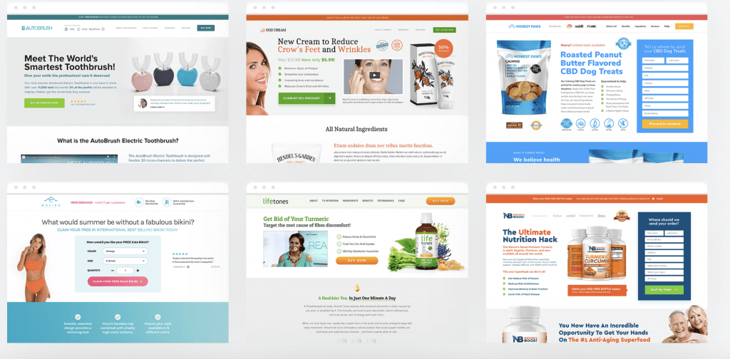
A: I would say this is very dependent on the product. Typically we see short form direct response sales pages performing the best overall. In our experience long form pages do not convert as well. Historically, they were very popular but with decreasing attention spans it can be off putting to have too much text. We are firm believers in keeping it simple and direct! However if you have a product that leans towards needing more information e.g. a herbal tea then utilising an advertorial in your sales funnel is also highly effective. Advertorials leading to sales pages are particularly good for native ads!Â
Q: Is there one type of landing page you would recommend for e-commerce? Why?
A: Absolutely, for e-commerce products we 100% recommend direct response sales pages, you can not beat them for conversion! Take your top selling product and create a standalone page for it, you can place it on a subdomain of your store. These are hidden pages only accessible by the link, so for all PPC and retargeting traffic this is our top recommendation. These pages have zero distractions – so no navigation around a store, zero traffic leaks – no social media icons! (killer for conversion) and typically load quicker than stores. The other major advantage of these pages are that you can increase your AOVs with bundling and rather than going to a cart the CTA goes STRAIGHT to checkout. The page should enable the consumer to understand how the product benefits them, show trust and social proof along with addressing any questions they may have. Check out this example http://lpgstage.com/1/pacamask-funnel/
Q: What is the one thing you’re still surprised that companies aren’t optimizing for in 2021?
A: We still see lots of companies driving traffic to un-optimised product pages. A product page should still follow conversion principles e.g. social proof, trust etc you are literally chucking money away if you are driving traffic to ‘old school’ product pages!Â
Q: If you have to choose the top 3-5 most important elements of CRO to recommend for e-comm sites to test, what would they be?
A: Difficult question!! Ecomm sites offer a veritable plethora of testing opportunities!
As a page that likely receives the most traffic beginning with the product page would make most sense. One thing to note however is if you are using a template be conscious that the changes will apply to all pages so you need to make sure they will make sense! We would say the top 3 elements to test would have to be imagery, headlines and CTA’s. For example: imagery should always be clear and front and centre however you could test adding lifestyle shots to the page or using 360° images. For your headlines you can test adding in different benefits of the product e.g. Product title “Biotin Hair Serum†try “Get Healthy Shiny Hair with Biotin Hair Serumâ€. Finally for CTAs you could test different colours, different text and of course different emojis!Â
Q: A/B testing is crucial for CRO, at what point during a test do you make a call when there is a winner? Is it time-based? How often should you be testing the same element before making a final call?
A: In our experience we typically run tests for 21 days. The reason we leave it this long is that whilst on day one or two you may see an instant uplift this may not be a true reflection of the test. It could be better traffic that day. Running the tests for 21 days allows you to collect enough data to determine if the test has been successful or not. Obviously this can feel risky if you see a drop in conversion rate and it’s for a sustained period then you need to weigh up the risk. You shouldn’t make too many changes to a page at one time otherwise you will not know which factor is impacting the conversion rate. Unless of course you are doing a straight A/B test and trying a whole new variation!Â
Q: Does CRO mostly center around design, funnels, or an all around start to finish design on both fronts? If so, where do you start?
A: CRO is an all encompassing science. Ideally you will be optimising at all times. The quickest and one of the most important aspects is to ensure your page/funnel/site is optimised for speed. No matter how great the page looks, if it’s slow to load you will lose conversions! Get rid of any unnecessary apps and of course where possible go for custom coding over any page builders. Utilizing your analytics will inform you best on where you can be making edits to keep pushing the needle up. Make use of tools like hotjar, these are incredible for showing you where your consumer is interacting or dropping off. There is so much to take into account. Who is your target audience? Are you hitting their key pain points with your content? Are you addressing any/all of their potential questions? Once you have the answers to questions like these you can then start to optimise your UX. Design is key! Your design should be engaging and make the page/site easy to navigate. Leverage social proof and trust throughout and you need to consider both desktop and mobile versions of your site. What looks great on desktop may not translate to mobile. Additionally, to decrease cart abandonment you need to minify the journey from the call to action to checkout and consider using polls and feedback tools to find out why people did or didn’t make their purchase. Don’t mix up messaging, keep it simple! Less is definitely more!
Q: We know the conversion rate avg, based on recent findings is around 2.35%, is there a rate you’re personally satisfied with or think that should be the goal for any given project, in e-commerce?
A: Our goal is to increase our clients’ conversion rates. Obviously the higher the better! Recently we took one client from 0.8% to 3.4% with an AOV of $50 – now with traffic of 50,000/month this equates to an additional $85,000 a month. Typically for a store we’d like to see between 3-6% CR. If you were already sitting on 5% then that’s a great position to be and that’s when that 0.5-1% uplift is game changing right?Â
Q: Thanks so much for your time. Is there anything else you’d like to add? Let us know where people can follow you, etc.
A: Thanks for having us! Here at LPG we have been creating high converting landing pages for our clients for the last 8 years! If you’d like to discuss with us how we can help increase your online success email [email protected] to arrange a free strategy call. To join us inside the number one social group for landing page optimisation click here and subscribe to our YouTube channel click here


