As technology changes, the standards for web design adapt alongside it. Ten years ago, developers created sites for desktops. Today, mobile-first is the way to go if you want to reach every user landing on your page. The look and feel of web design in 2021 are a bit different thanks to advances in computers and shifting trends.
According to the U.S. Bureau of Labor Statistics (BLS), there are about 160,500 American web developers. However, the world is a global economy, and designers come from all over, making competition fierce. Such a wide variety of professionals also drives trends in web design.
There are some definite do’s and don’ts when it comes to creating a website. Keep these factors in mind if you want to stand out from other people in your field and snag those top-tier clients.
Top Do’s for Creating a Website
What are the do’s and don’ts in web creation? How do you know what to embrace and what to ignore? There are some solid do’s you can check off your list to get the most mileage from your design efforts.
Do: Consult With Your Client
The most beautiful design imaginable isn’t going to impress your client if it doesn’t meet their needs. Your first step for any web design job is to talk to the client and get a feel for the website. What do they hope to accomplish?
Communication is key, so take the time to discuss buyer personas and study the brand’s competition. How can you meet the client’s needs but also keep the expectations of their users in mind?

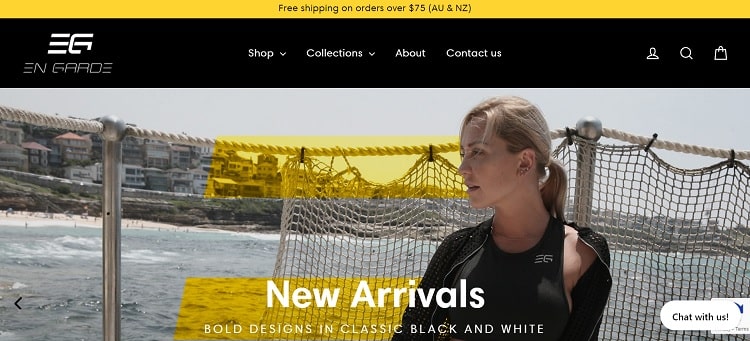
En Garde’s website design embraces the boldness of the apparel line and showcases the brand’s personality for first-time visitors. Note how the vivid yellow is reflected both in the design’s colors and added to the images as overlays.
Do: Showcase Your Site at Public Events
Think through how your designs translate into public event promotions, such as guiding people at a trade show to your website. Is the domain address short and to the point? Will users be able to remember the name when they get home from the convention? Think about how well the URL matches the brand image.
Do: Use Cascading Stylesheets
Cascading stylesheets (CCS) aren’t likely to go out of style anytime soon. They lend consistency to your design, helping you pull up the same fonts, color palette and rules no matter what page you add to the lineup. CSS saves designers time and helps prevent costly errors from driving users away.

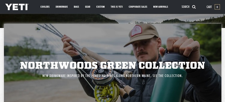
Yeti uses stylesheets to ensure a consistent look no matter where you navigate on its site. If you’re on the home page, it looks similar to any of the product pages. Each page’s header is similar, with the logo in the same spot and navigation easy to spot and learn.
Do: Study Top Designers
If you want to catch new trends before they become outdated, follow some of today’s top designers. Take a look at websites winning awards or mentioned in media. What do the designers do that you particularly like? How can you repeat their efforts in your designs?
Pay attention to elements you see repeated, particularly in the industry you’re designing for. If every e-commerce store seems to have a live chat, incorporate a chatbot into your design.
Do: Choose a Focus
Once you understand the purpose of a page, create a focal point for users. If the goal is to convert them into newsletter subscribers, then everything on the page should encourage the visitor to share their email. Use arrows, images where a person looks toward the call to action (CTA) button and any other method you can utilize.

Order Up! uses arrows both in obvious and subtle ways to drive users through the process of signing up. Note the arrow pointing to a QR code and inviting you to try it out on mobile. There is also a small arrow on the CTA button indicating movement through the site.
Although there are many other ways to stay on top of trends and elements you should add to your pages, every client will be different. The do’s above will get you started, but be aware of each brand’s unique needs.
Big Don’ts in Web Design
Just as there are some tried-and-true methods to create amazing designs for companies, there are also some things you should avoid.
Don’t: Bog Down the Page
Be careful with the code you write. Nothing screams amateur louder than broken elements on a page or a slow-loading design. Condense images so they load quickly, use caching and avoid unnecessary scripts. Although most users are on high-speed internet these days, there may be an occasional visitor with a slower connection. You don’t want anyone to bounce away because the site fails to load quickly.
Don’t: Forget Mobile Users
According to Statista, mobile data traffic will increase seven times over its current levels by 2022. There are currently around 4 billion people using their smartphones to get online. When designing your site, make sure it adapts to smaller screens.
Test your website thoroughly through online generators showing how the site looks on different devices and your smartphone. Make sure every element is user-friendly and works as expected.
Don’t: Use Too Many Colors
The brand you design for likely has a color palette. It’s tempting to add multiple colors and drive messages home with bright buttons and text. However, adding too many shades to a page can make it look juvenile.
Limit your choices to the brand’s color palette, plus a single accent color complementing the ones already there. If the brand has accents already in place, stick with them. It’s fine to use a random burst of red, blue or yellow for a CTA button you want to stand out from the rest of the design.
Never Finish Refining the Site
An aesthetically pleasing and functional website is an asset to a business. However, your work isn’t done just because the site is live. Look for ways to improve your design as users start interacting with it. Try different options and split-test them to see how the target audience reacts. Can you increase the conversion rate with a new button placement? Keep working on the site and updating as trends change, and you learn more about the customers buying from the brand.


