Shopping cart abandonment rates are always top of mind for retailers. As these rates are naturally very high, every bit of it you can bite into and get a piece of means big revenue growth. Just reducing your cart abandonment rates by .5% would be considered a big win and make a big difference for the websites revenue.
So, what are reasons customers in 2020 are abandoning shopping carts in 2020? Baymard Institute did some research with 4,560 adults and came up with these results.
A LITTLE BIT ABOUT BAYMARD.
Baymard conducts original large-scale research studies on all aspects of the online user experience – from ‘form field labels’ to the ‘entire mobile experience’.
We believe in what we call ‘actionable research’ – taking the originality and thoroughness of academic research and presenting it in a pragmatic and user-friendly format.
Baymard’s research is used by more than 3,000 brands, agencies, researchers, and UX designers, across 80+ countries, and includes 71% of all Fortune 500 e-commerce companies.
TOP 10 REASONS FOR SHOPPING CART ABANDONMENT
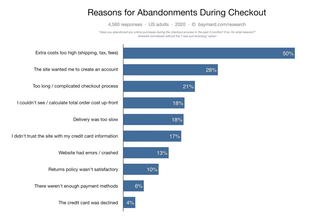
It’s important to note (while obvious to most) that these are reasons why users are abandoning their cart while shopping on the website, not why they aren’t buying a certain product.
As they put it in the report, “Now in all fairness to the e-commerce industry, a large portion of cart abandonments are simply a natural consequence of how users browse e-commerce sites – many users will be doing window shopping, price comparison, saving items for later, exploring gift options, etc. These are largely unavoidable cart and checkout abandonments.”
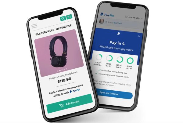
- Extra cost too high (shipping, tax, fees) : This one is usually on top of the list as far as I can remember. While free shipping has become a staple of e-commerce to succeed in order to better compete with the Amazons of the world, with new laws and regulations revolving around taxes in states for e-commerce, fees at checkout are a reason for hesitation to convert the sale. If you offer free shipping, make sure you make it very clear on your website. If you do charge shipping, it may be a good idea to market on your website a strategy such as ‘Free Shipping On Orders Over $100’, etc.
- The website forced account creation: Your website should always have an option for guest checkout. Sometimes a consumer just found a product for gifting or whatever the reason may be that they do not want to create / store information on your website and want the quick checkout experience. Not sure why anyone in 2020 wouldn’t have a guest checkout option?
- Too long / complicated checkout: I personally am a fan of the one-page checkout. However, I have seen even better conversion rates sometimes on 2 page checkouts such as Shopifys checkout (that’s the one I’m personally most familiar with.) Either way, your checkout should be seamless and simple. If you’re still not sure that’s the case, ask friends and family to go through the process and give you honest feedback. A quick tip is including something like Amazon Pay can facilitate checkout with stored customer info.
- Couldn’t calculate cost up-front: This pretty much means the customer wasn’t sure how much they had to pay within a few steps of getting close to the final pay button. The easiest way to combat this is having a calculate cost option at cart NOT at checkout.
KEY FINDINGS:
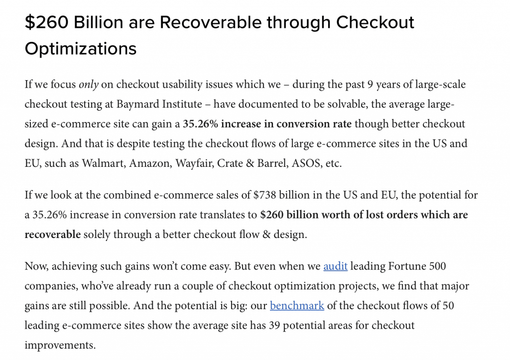
- 21% of US online shoppers have abandoned an order in the past quarter solely due to a “too long / complicated checkout processâ€.
- Now, our large-scale checkout usability testing shows that an ideal checkout flow can be as short as 12-14 form elements (7-8 if only counting the form fields).
- Yet, our checkout benchmark database reveals that the average US checkout flow contains 23.48 form elements displayed to users by default. (14.88 if only counting the form fields.)
In other words, 1 out of 5 shoppers have abandoned a cart in the last quarter due to a “too long / complicated checkout processâ€, yet for most checkouts it’s possible to make a 20-60% reductionin the number of form elements shown to users during the default checkout flow. And again, this is just 1 of the 134 documented causes for checkout usability issues.
CONSTANTLY CHECK AND TEST
Checkout is such an important element and part of your website that you want to make sure you are optimizing to increase conversion rates. Small changes can go a long way. As you can see from above, even the largest e-commerce websites have room for improvement at checkout, I’m certain you can find some optimization wins as well.
SOME QUICK TIPS & ADVICE:
Here we list some quick tips and advice toward optimizing the conversion process as the customers journey leads to checkout.
- Display trust signals throughout the site to ensure customer trust your website. These can include things such as BBB (though that is a bit outdated,) but you get the point.
- Provide real-time live chat: Through any issues or questions as consumers shop, talking to a live customer support member makes the experience easier to solve whatever issue or question they may have.
- Incentivize the purchase: Gift with purchase and anything that is free is always a great incentive to push the sale. Especially when competing with the likes of Amazon which will give that additional push for the consumer to choose your site over the competition.